Crowdsourcing Manuscript Transcription

Gregory D. Massey’s 2005 article in The Public Historian, “The Papers of Henry Laurens and Modern Historical Documentary Editing”, is a case study that traces the changes in historical editing over the last forty years. Though, “the Laurens Papers adopted a method that was more labor intensive than verification procedures at many projects.” (p. 50), the transcription process of colonial-era document collections is overwhelmingly time consuming.

Massey explains that, “Over the past twenty years, the Laurens Papers’ difficulties in maintaining a staff and producing volumes in the face of budget constraints mirror the problems faced by other projects as federal support for documentary editing has decreased or remained stagnant. ” (p. 1) The publication of documentary editions of first-tier, priority designated projects like the papers of Thomas Jefferson, Benjamin Franklin, Alexander Hamilton, James Madison, and the Adams family, struggled far less for financial support, but they too required decades to accomplish.

Though a incorporation of the public into the transcription process of colonial-era manuscript collections is unprecedented, other projects have successfully employed crowd sourcing online. The most prominent large scale projects are related to the USGenWeb Project. “The USGenWeb Digital Library (Archives) was developed to present actual transcriptions of public domain records on the Internet. This huge undertaking is the cooperative effort of volunteers who either have electronically formatted files on census records, marriage bonds, wills, and other public documents, or are willing to transcribe this information to contribute. ”

An early standout smaller scale project is the Colorado Rivebed Case (completed almost 10 years ago), which incorporated volunteers with their own resources into their OCR project. In an online environment, OCR projects are easier to outsource to the public than manuscript transcription. Massey’s article reflects the intense level of verification procedures that accompany traditional archival techniques and it is likely this strain of thought that has prevented the archival community from actively engaging in conversations concerning crowd sourcing and transcription.

The Interactive Archivist: Case Studies in Utilizing Web 2.0 to Improve the Archival Experience” on The Society of American Archivists website provides a useful summary of the interests of the archivists in social networking and the usefulness of tagging, commenting/reviewing and rating services, but does not mention strategies for incorporating users into the archival process at the transcription or description level that remains the domain of archivists. In, “Archives of the People, by the People for the People”, published in the Fall 2007 American Archivist, Max J. Evans, “introduces the concept of commons-based peer-production as a means of turning collections inside out. It encourages archival institutions to reinvent themselves, and, in collaboration with other archives and with other types of organizations, to organize archival work in concert with a curious and interested public.” The public image of the Association for Documentary Editing seems more conservative in regards to technology. The only hint of community involvement consists of an invitation to join The Scholarly Editing Forum (SEDIT-L).

Andrea Odiorne

leads generated by a Spellbound Blog post.

Leave a comment

Filed under General

Final Project

So, my project is done. Well, it isn’t exactly done, but I feel that I completed what I set out to do. I added more items than I expected and did a lot less with the videos than I had planned. I was a little frustrated by using a content management system at first, because I spent a great deal of time trying to understand how some of the PHP functioned work and identifying divs. But when it came to inputting content, I was very glad to be using Omeka. The exhibit builder plugin was a real help.

Though I was concentrating mostly on the senses of sight and sound (my “content” that was produced before the course was on visual history), I was able to provide short video clips Micheal O’Malley on smell and taste. I also provided information and links on smell, taste and touch.

So I am finished since it is almost midnight, but I still have to work on the site. I promised the interviewees an email with a link. I am going to have to vastly improve the videos by then. They would have been much more elaborate, but I am such a lousy narrator that I just couldn’t do much. I will have to rope some voice talent in if I am going to finish this project. Is anyone interested?

Leave a comment

Filed under Clio class

HTML and CSS Mockups

I am happy to report that I didn’t have any CSS issues that forced me to change my design mockups. I did however make some changes to the design due to some comments from Jeremy and Trevor. I agree with Sharon that this has been the most challenging assignment so far. And though I wouldn’t call my product bulletproof, my CSS validates. The major changes include the header, footer and navigation.

  1. Header: I changed the logo to call more attention to the movie reel icon by making my black underline smaller. I spent a lot of time working with the gif transparency. I ended up with an okay product, but in the end I didn’t even need it.
  2. Footer: It was suggested that the navigation image of people listening to the radio was visually detracting from my primary navigation, but that it was a good image and should be used elsewhere. I decided to use it as the footer, covering the text that came with the image with my copyright info. I had a more trouble using this image as a transparency, particularly when it was larger. The image was also very tall and narrow for a footer. Then I realized I could cut and paste the wave images, widening the image considerably.

    When I widened the image I felt that the overall design was too lose, and lacked geometrical appeal. I still feel this way, but I made what I believe is an improvement by making color blocks for the header and footer. I used a lighter image background for these because I also thought it was a little too dark.

  3. Navigation: I moved the navigation on the home page to inline navigation below the video essay image links. I spent a lot of time tweeking this and I am still not finished. I don’t really understand but I had to make the ul background wider than the content area for the background to go all the way across. I also adding a lot of padding the the li elements to make them sit on the background the way I wanted. I think I probably did this the hard way. I will probably look into an easier way when I move over to Omeka.

    Since I feel like the design is flat, I tried a lot of gradient layers for the navigation bar background image and shadows and all kinds of things. They all looked terrible so I moved on. Also, it would look strange for one lone element to have texture or color fading styles when nothing else does.

Conclusion: I really learned a lot. I found making changes addictive and actually pretty fun. I know where top, right, bottom, and left are. I spent over an hour trying to right align the ‘download script’ link with an inline a element and fixed positioning and finally used a span with left padding. It worked.

I don’t think my site really looks like a professional site, it is flat and pretty over-simplified. But I think I got a lot done, with just a little bit of knowledge and it is very encouraging. I need to add a script for the text roll-overs on the home page. I played around with some things, but couldn’t quite get it ready for tonight’s presentation.

2 Comments

Filed under Clio class

Wireframes vs. Mockups

When thinking about how to implement my design mockups and what kinds of changes might need to be made, I realized that I should probably have included in my design rationale blogpost,
the reasons for the significant departure from my wireframes in my mockups.

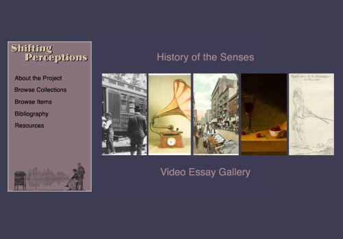
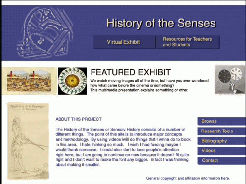
1. Homepage Design: My original home page was designed around a feature exhibit and project information. The mockup home page is designed around the original exhibit navigation scheme. The five images for navigation are consistent with the wireframes, but the navigation has been reconfigured.

2. Navigation: When working with the wireframes, I decided on navigation links that changed a little bit from page to page. This seemed to make sense. Every element was a fun little building block that I could move anywhere I wanted. So I did.

Also when switching between wireframes, consistency seemed stale and I felt the need to modify each page. When creating the mockups, I noticed the opposite effect. Switching navigation link positions seemed visually awkward. Also, consistent elements from page to page did not seem stale. Repetition had the effect of letting the title and navigation elements take a bit of a backseat and held a simple reassurance.

3. Logo: I hadn’t thought about the logo much before our design discussions. I had a simple title flanked by two images in my wireframes. But I decided to take on a name for the site and design a logo to go with it. This was not a major change from the wireframes, but I thought I’d mention it.

Conclusion: I am sure that my mockups won’t be exactly realized once the pages are up and running. But maybe that’s not an altogether bad thing.

Leave a comment

Filed under Clio class

Design Rationale

I have uploaded my design images to my site.
Sorry you have to go back and forth, navigation coming soon.

Leave a comment

Filed under General

Final Home Page Design?

shiftingphomepagesun1

The deadline for the design concept is quick approaching and I hope I am near the end.  I have worked up some of the secondary pages, but I thought I would put this last (?) home page design up before the links to my final mock-ups for possible commenting.


Longer nav box, thanks Susan!

shiftingphomepagesunfullforblog1

2 Comments

Filed under Clio class

Access

This weeks readings on accessibility are likely relevant to most of us, since if we are doing design, we are probably going to work for educational or government institutions. The attitude that Clark describes by some programmers and companies that the disabled are not an important audience, is surely hard to find at these institutions. At the very least as Clark explains, “you have, in effect, another paragraph to add to your résumé.”

Due to the many accessibility issues involved in the video medium, I am very interested finding solutions. I am slightly familiar with audio description, and I know how closed captioning works. Transcripts are fairly easy for me to make, because I tend to stick to the script I write. For my project I am going to do what Clark rallies against, adding a separate free standing transcript.  I want to do this for searchablilty and so that all users will be encouraged to look at the transcript.

It was a relief when Bohman explained that most screen readers have similar functionality. I was afraid of more cross-testing issues.  Techniques I would like to use regularly are: always using alt tags and using empty alt tags for appropriate graphics, providing the option for screenreader users to skip redundant navigation, and organizing content on the html pages in a matter coherent to someone that is tabbing through. These are definitely, yet other good reasons to test the page with the styles turned off. I am curious about how using php might effect these accessibility issues.

Oh and just an aside Clark claims: “We have the Web. We have television. Like matter and antimatter, the two should remain separate.” I disagree.  Hulu rocks.

1 Comment

Filed under General

More Design Stuff

So I am just posting as I go along. Feedback welcome.
shiftinghomepage1s

     I have moved what was my exhibit navigation page to the home page, as Jeremy Boggs suggested, in order to draw in visitors.  I also changed the color palette to what I believe to be a balance of my previous color schemes.  My logo is also spared down some, though I am not sure about the movie reel anymore.  I played around with some other fonts, but I settled on Helvetica.

     I used Paula Petrick’s tip on the engraving image in my sidebar navigation and I’m pretty happy about how it turned out.  I am relying solely on this side panel and leaving out a header and footer because I think it makes for a more clean look.  I might put a brief small copyright at the bottom.

     Update:  I have changed the proportions a bit.  Thanks Sharon!

shiftingphomepagesat

1 Comment

Filed under Clio class

Design ideas

hhomepage1blackandwhite
greenhome

Leave a comment

Filed under General

Photoshop Restoration

So, I was already familiar with color, tone and contrast, but Eismann’s book really broke apart and explained what I always approach as an unorganized mess of filter layers.

It’s amazing what can be done when you zoom into the pixel level. The restoration and rebuilding techniques particularly impressed me. Photoshop takes a little more than a minute to learn and definitely a lifetime to master. I hope to run into reasons to use the techniques put forth in this book and really need to get into the habit of using shortcuts like the pros.

Petrick’s tutorial was very helpful. Matting techniques are a great way to make line based images fit into a design theme. I hope to use them for my site.

1 Comment

Filed under General